
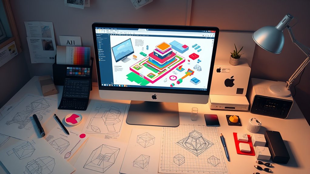
To create isometric illustrations in Illustrator, start by setting up an isometric grid with axes rotated at 30° angles and enable snapping. Use basic shapes like squares and parallelograms to build 3D forms, then combine them with the Shape Builder Tool for clean, unified designs. Add shading, textures, and details to improve realism. For complex scenes, assemble simple components carefully. Keep exploring these techniques to make your designs more polished and professional.
Key Takeaways
- Set up an isometric grid with axes rotated at 30° angles for accurate 3D visualization.
- Use guides, snap-to-grid, and the Shape Builder Tool to construct precise geometric shapes.
- Apply consistent light sources, gradients, and transparency to add depth and realism.
- Combine simple shapes into complex scenes, maintaining perspective and color harmony.
- Export artwork using appropriate formats like PNG, SVG, or PDF for web or print use.
Understanding the Basics of Isometric Projection
To grasp isometric illustration, it’s essential to understand isometric projection, a method that visually represents three-dimensional objects on a two-dimensional plane. This technique relies on axonometric methods, which project objects without perspective distortion, maintaining equal scale along all axes. Unlike traditional perspective, where distant objects appear smaller, isometric projection keeps all dimensions consistent, giving a clear view of complex structures. This approach allows you to create accurate, easily comprehensible illustrations. By understanding how axonometric techniques eliminate perspective distortion, you can accurately depict depth and form without the visual tricks of perspective. Mastering this foundation helps you craft precise isometric art, making your illustrations both visually appealing and geometrically correct. Additionally, understanding the importance of equal scale projection ensures your drawings remain true to the original dimensions throughout the process.
Setting Up Your Document for Isometric Work
Before diving into creating isometric illustrations, it’s important to set up your document correctly. Start by choosing the right artboard size to accommodate your project’s scope. Next, configure the color settings based on color theory principles, guaranteeing your palette supports depth and harmony. Third, set up your grid preferences, considering guidelines that align with your isometric projection. Finally, plan your typography choices early, selecting fonts that complement the visual style and maintain readability. Proper setup allows for consistent, balanced compositions, and simplifies workflow. By paying attention to these elements, you ensure your document is optimized for precise isometric work, setting a solid foundation for developing striking, cohesive illustrations.
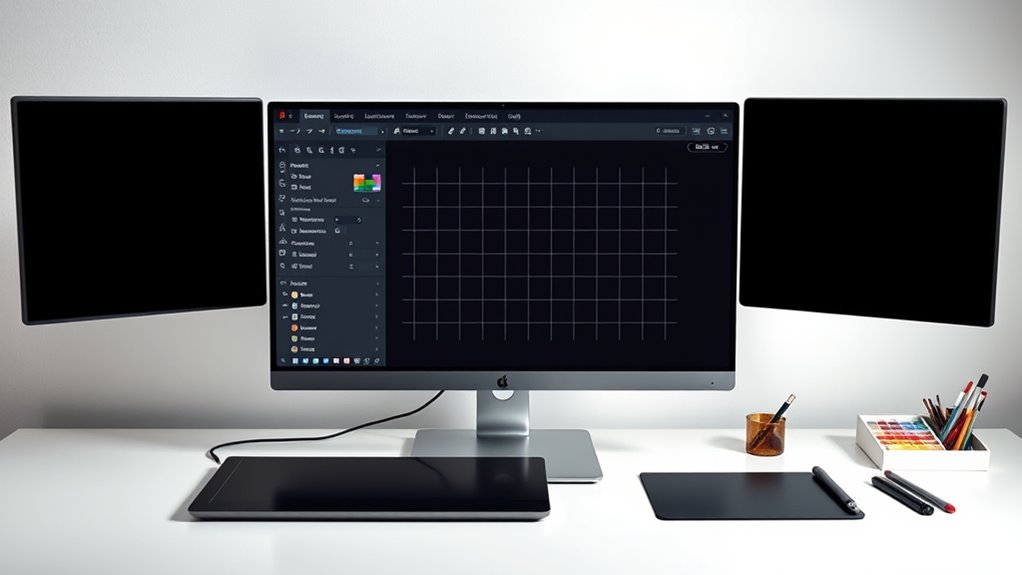
Creating the Isometric Grid in Illustrator
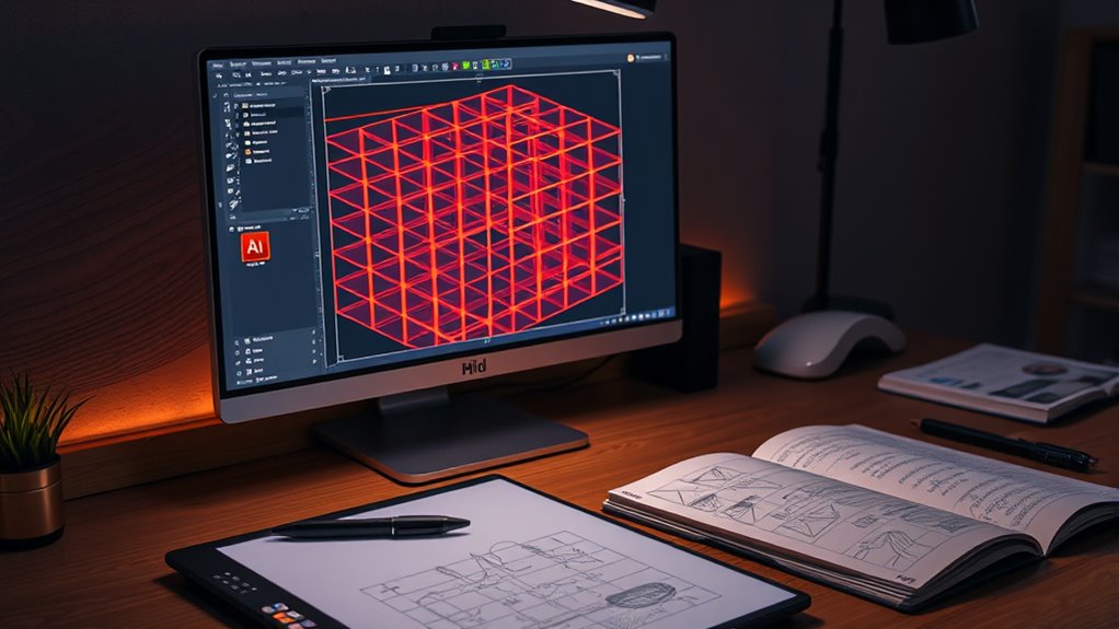
To create your isometric grid, start by drawing the isometric axes to establish the correct angles. Then, set your grid preferences to match the isometric style and use guides to guarantee proper alignment. These steps will help you build a precise and consistent foundation for your illustration. Incorporating an understanding of color accuracy can also assist in creating visually appealing designs with correct color representation. Additionally, paying attention to grid settings ensures your shapes align perfectly within the isometric perspective for a professional look. Being aware of paint consistency also plays a role in ensuring your digital design accurately reflects real-world materials and finishes. Moreover, understanding creative techniques can further enhance your ability to develop dynamic and engaging isometric illustrations. Recognizing the importance of workspace organization helps streamline your workflow and improves overall efficiency during the design process.
Draw the Isometric Axes
Have you ever wondered how to create a precise isometric grid in Illustrator? Drawing the isometric axes is essential for establishing the correct axis orientation. To do this effectively, follow these steps:
- Use the Line Segment Tool to draw three lines intersecting at the origin point.
- Rotate two lines at 30° angles from the horizontal to match the isometric axes.
- Ensure one line remains horizontal, representing the vertical axis.
- Adjust the length of each axis to suit your grid scale.
- Incorporate isometric projection principles to accurately visualize three-dimensional objects in two dimensions. Additionally, understanding independent axes helps in maintaining accurate perspective and alignment throughout your illustration process.
- Properly aligned axes are essential for maintaining consistent spatial relationships in your illustrations. Recognizing the importance of alignment accuracy can improve the overall precision of your isometric drawings.
These isometric axes define the axis orientation, which guides your drawing process. Accurately drawing these lines helps you maintain perspective, ensuring your illustrations are consistent and true to isometric projection. Properly aligned axes are the foundation for creating precise isometric illustrations.
Set Grid Preferences
With your isometric axes in place, it’s time to set up your grid preferences to create a consistent isometric grid in Illustrator. First, access the Preferences menu, then navigate to the Guides & Grid section. Here, you’ll adjust the grid setup to match your isometric projection. Set the grid line spacing to match the angles of your axes, typically with a 30° or 45° angle, depending on your style. Change the gridline subdivisions for finer control, ensuring your shapes snap neatly into place. Perform a preference adjustment to enable “Snap to Grid,” which helps maintain precision. Once configured, your grid setup will align perfectly with your axes, providing a reliable foundation for creating accurate isometric illustrations. Understanding the comparative advantage principle can help you optimize your workflow and resource allocation during your design process. Additionally, familiarizing yourself with digital asset management concepts can inspire innovative approaches to organizing your project files and assets. Incorporating knowledge of environmental considerations can also guide you in creating sustainable design practices even in digital projects. Furthermore, adjusting your grid settings according to industry standards ensures compatibility with common design workflows and facilitates collaboration.
Use Guides for Alignment
Using guides for alignment is essential to guarantee your isometric grid stays accurate and consistent. Guides help maintain precision during grid setup and ensure your shapes align perfectly. To optimize your workflow, consider these alignment tips:
- Drag guides from rulers to mark key points, ensuring even spacing.
- Use the Transform panel for exact positioning of guides and objects.
- Lock guides once positioned to prevent accidental movement.
- Regularly check alignment with snapping options enabled for consistent placement.
- Incorporate proper grid setup techniques to create accurate isometric illustrations and streamline your design process.
These steps help you create a reliable grid setup, reducing errors and streamlining your process. Guides serve as visual anchors, making it easier to draw accurate isometric shapes and maintain uniformity across your illustration. Proper use of guides is fundamental for precise, professional results.
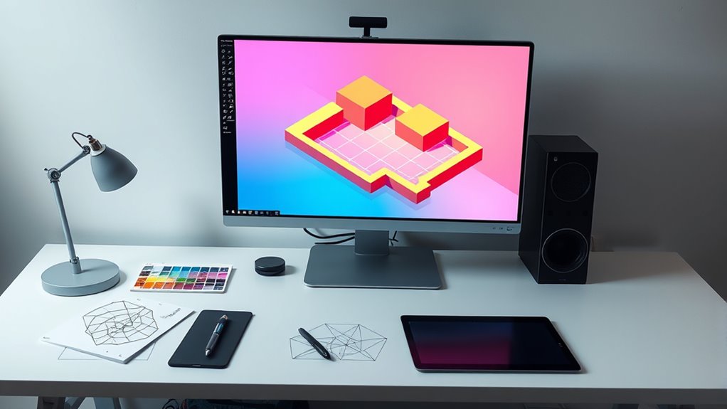
Drawing Basic Isometric Shapes
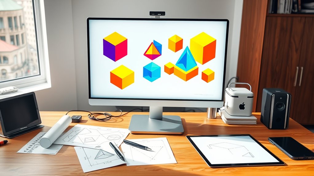
To start drawing basic isometric shapes in Illustrator, you first need to understand how to create the fundamental geometry. Begin by drawing a cube using simple shapes like squares and parallelograms, ensuring your angles are consistent at 30 degrees. Use shading techniques to add depth; subtle gradients or darker shades on one side can make your shapes appear three-dimensional. Select a cohesive color palette to maintain visual harmony across your illustration. When applying colors, consider light source direction to enhance realism. Keep your lines clean and precise, leveraging guides and snap-to features for accuracy. Additionally, understanding self-watering plant pots can inspire creative design elements that incorporate functional aesthetics, enriching your isometric illustrations. Incorporating anti-aging effects into your shading and coloring techniques can also help achieve a more polished look. Mastering these basic shapes sets a solid foundation for more complex isometric designs, helping you develop a consistent style throughout your artwork. Additionally, understanding essential oils for toothache relief can improve your overall well-being, which indirectly supports your creative focus and productivity. Moreover, practicing these foundational skills prepares you for exploring more advanced GMC tuning techniques to elevate your design projects further. Exploring sound design principles can also enhance your understanding of how to create visually appealing and engaging illustrations.
Using the Shape Builder Tool to Combine Elements
The Shape Builder Tool helps you merge overlapping shapes easily, creating clean, unified forms. It also simplifies complex designs by reducing multiple elements into a single shape, saving time. Using this tool boosts your efficiency and gives your isometric illustrations a polished, cohesive look. Additionally, understanding spiritual practices can inspire creative visualization and storytelling within your artwork, enriching its depth and meaning. Furthermore, considering retail hours can help you plan your creative sessions around store schedules, ensuring you have access to supplies when needed. Incorporating FAQs and best practices from related design techniques can further enhance your workflow and output quality.
Merging Overlapping Shapes
When shapes overlap in your illustration, merging them with the Shape Builder Tool simplifies your design and creates clean, unified forms. This process enhances shape blending and manages overlapping layers effectively. To do this efficiently:
- Select all overlapping shapes using the Selection Tool.
- Activate the Shape Builder Tool (Shift + M).
- Click and drag across the areas you want to combine.
- Release to merge the selected shapes into a single, seamless form.
This approach reduces unnecessary complexity, improves flow, and ensures your illustration remains crisp. Merging overlapping layers with the Shape Builder Tool helps you control the visual hierarchy and maintains the integrity of your isometric perspective. It’s a powerful step in refining your illustration’s overall cohesion.
Simplifying Complex Forms
Simplifying complex forms becomes much easier when you use the Shape Builder Tool to combine multiple elements into a single, cohesive shape. This tool allows you to seamlessly merge overlapping or adjacent shapes, reducing unnecessary complexity. As you work, consider shading techniques to add depth and dimension, enhancing the clarity of your illustration. Using a consistent color palette helps unify the design and emphasizes the simplified forms. The Shape Builder Tool also makes it easier to adjust the overall structure without losing detail, keeping your isometric perspective intact. By streamlining your shapes, you create cleaner, more professional illustrations that communicate effectively. This approach not only improves visual coherence but also lays a solid foundation for applying shading techniques and color choices later in your design process.
Enhancing Design Efficiency
Using the Shape Builder Tool to combine elements considerably boosts your design workflow by allowing you to quickly merge multiple shapes into a unified form. This streamlines your process and reduces unnecessary steps. To maximize efficiency:
- Maintain consistent color harmony by selecting harmonious shades before merging, ensuring a cohesive look.
- Use the tool to align shapes precisely, improving overall symmetry and balance.
- Incorporate typography choices early by grouping text with related shapes for seamless integration.
- Simplify complex forms by combining overlapping shapes, making adjustments easier and faster.
Applying Color and Shading for Depth
Applying color and shading effectively brings your isometric illustrations to life by adding depth and dimension. Start with smooth color blending to create seamless transitions between light and shadow, which enhances realism. Use shading techniques like gradient fills or subtle shadows to emphasize the different planes and angles of your objects. Focus on consistent light sources, applying darker shades where shadows naturally fall and lighter tones where highlights occur. Keeping a limited color palette helps maintain harmony across your illustration. Experiment with opacity and layer blending modes to refine shading effects. Remember, precise application of color blending and shading techniques transforms flat shapes into dynamic, three-dimensional forms, making your isometric artwork more engaging and visually appealing.
Adding Details and Textures to Enhance Realism
To make your illustration more realistic, try incorporating pattern overlays and subtle textures. Use gradients and transparency to add depth and variation to surfaces. These details will help your isometric scene feel more tangible and visually engaging.
Incorporate Pattern Overlay
Incorporating a pattern overlay can substantially boost the realism and visual interest of your isometric illustration. By applying pattern layering through overlay techniques, you add depth and texture that make objects more convincing. To do this effectively, consider these steps:
- Choose a pattern that complements your design and enhances surface details.
- Place the pattern layer above your base shape in the layers panel.
- Set the blending mode (e.g., Overlay, Soft Light) to integrate the pattern seamlessly.
- Adjust opacity to control the pattern’s visibility without overwhelming the illustration.
This process emphasizes pattern layering’s role in adding subtle details. Proper overlay techniques help your artwork feel more textured and realistic, transforming flat shapes into more engaging visual elements.
Utilize Gradient and Transparency
Building on your pattern overlay techniques, adding gradients and transparency can considerably enhance the depth and realism of your isometric illustrations. Gradient blending allows you to create smooth transitions between colors, giving objects a more three-dimensional appearance. Use subtle gradients on surfaces to simulate light and shadow, making your illustrations more dynamic. Transparency effects help add depth by layering objects or creating reflections and glass-like surfaces. Adjust the opacity to control how much underlying elements show through, adding complexity without clutter. Combining gradient blending with transparency effects helps mimic real-world materials and lighting conditions, making your isometric illustrations more convincing and visually appealing. Experiment with different gradient directions and transparency levels to achieve the desired realistic effect effortlessly.
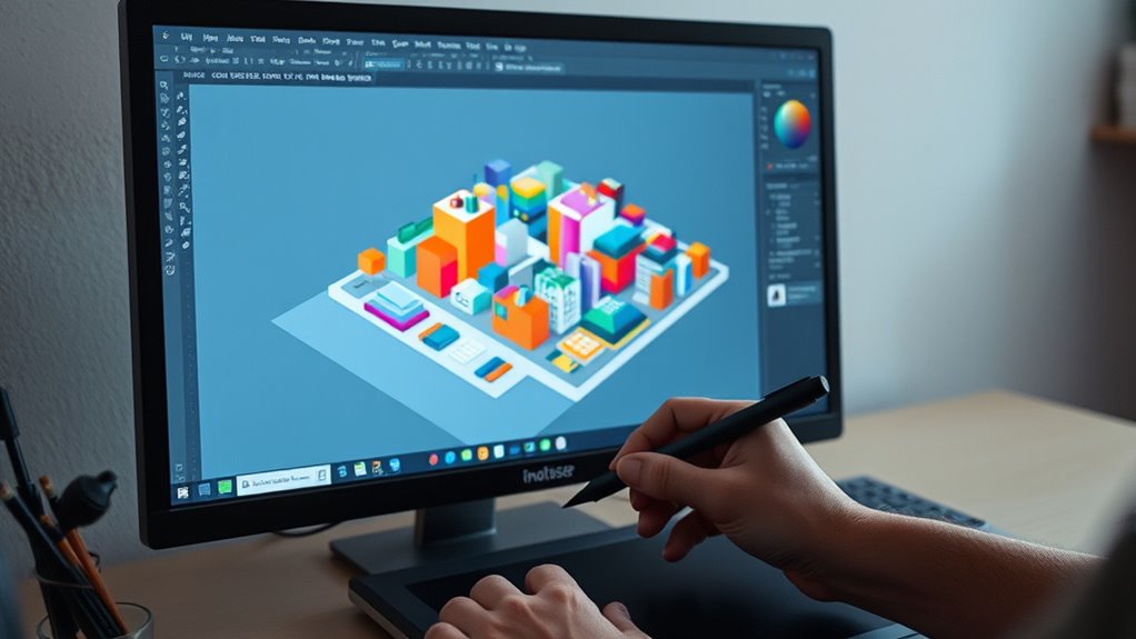
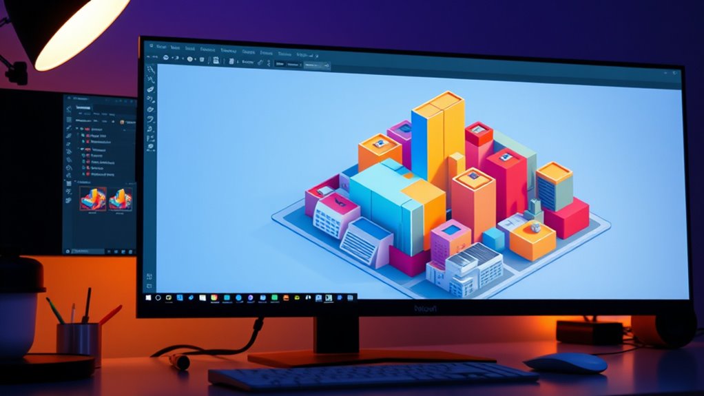
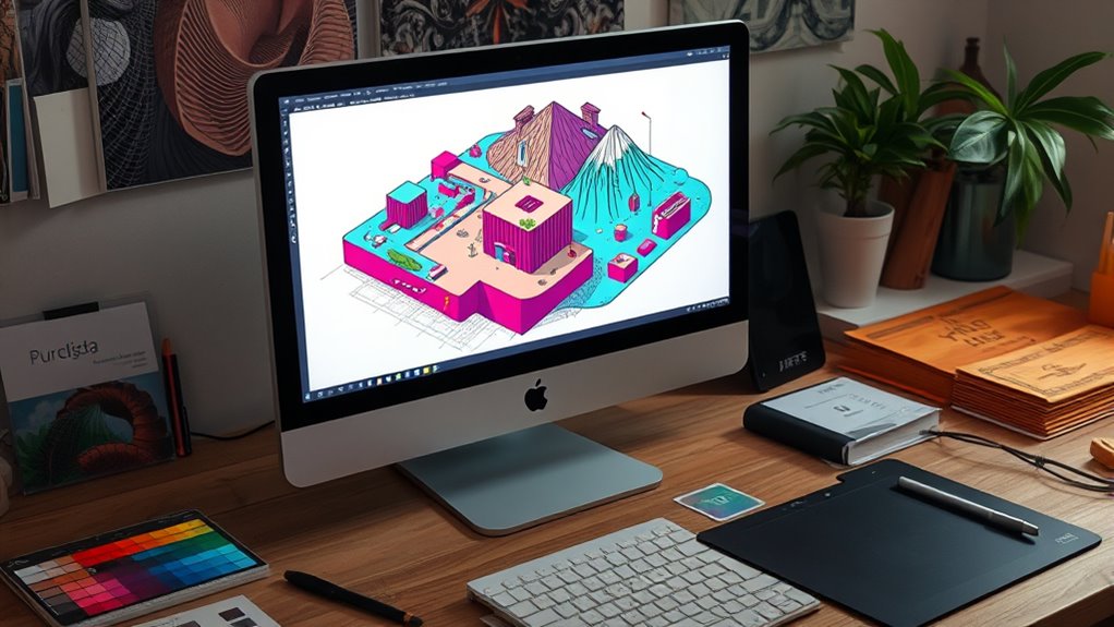
Assembling Complex Scenes From Simple Components
Creating complex scenes in isometric illustrations starts with breaking down your overall idea into simple, manageable components. This approach helps you focus on visual composition and maintain color harmony across elements. To build a cohesive scene, consider these steps:
- Sketch the main structures and foreground objects to define the scene’s layout.
- Develop smaller details that add depth, like furniture or foliage, ensuring they align with the overall perspective.
- Group related components to manage layers efficiently during assembly.
- Adjust color schemes to unify the scene, emphasizing harmonious hues that guide the viewer’s eye.
Exporting Your Isometric Artwork for Various Uses

Are you ready to share your isometric artwork with the world? When exporting, consider your target platform and adjust your settings accordingly. Use the appropriate color palette to maintain color consistency across devices. For print, opt for high-resolution PDFs or TIFFs; for web, choose optimized PNGs or SVGs. Perspective techniques influence how your artwork appears; ensure your export preserves these details. To streamline your workflow, select specific artboards or layers to export only what’s necessary. Use this table to compare common export options:
| Format | Best Use | Resolution | Transparency |
|---|---|---|---|
| PNG | Web, UI elements | 72-300 dpi | Yes |
| SVG | Scalability, vector graphics | Infinite | Yes |
| Print, high-quality sharing | 300 dpi+ | Optional | |
| TIFF | Professional printing | 300 dpi | Usually Yes |
Tips for Improving Efficiency and Precision

To enhance your efficiency and precision in creating isometric illustrations, leverage keyboard shortcuts and custom actions within Illustrator. These tools streamline repetitive tasks, allowing you to focus on design details. Additionally, consider these tips:
Boost your isometric design workflow with shortcuts and custom actions for faster, more precise illustrations.
- Use shortcuts for switching between selection, pen, and shape tools to speed up workflow.
- Create custom actions for applying consistent color harmony, ensuring your color palette stays cohesive across the illustration.
- Incorporate grid snapping and alignment features to maintain precise isometric angles.
- Experiment with typography choices early to balance text placement, enhancing overall clarity and aesthetic consistency.
Frequently Asked Questions
What Are Common Mistakes to Avoid in Isometric Illustration?
When working on isometric illustrations, you should watch out for perspective errors and inconsistent scaling. It’s easy to accidentally distort proportions or misalign angles, which can ruin the illusion. Double-check your grid and guidelines regularly to stay accurate. Avoid rushing, and always compare different parts to ensure consistent scaling. Paying attention to these details helps create a clean, professional-looking isometric design that stays true to the style.
How Can I Create Animated Isometric Scenes in Illustrator?
Did you know 65% of designers find animated scenes more engaging? To create animated isometric scenes in Illustrator, focus on dynamic scene creation by breaking your illustration into layers. Use layered animation techniques like moving individual layers or groups to simulate depth and motion. Set keyframes and use the Timeline panel to animate progressions smoothly. This approach helps craft lively, engaging scenes that captivate your audience.
Which Color Schemes Work Best for Isometric Designs?
When choosing color schemes for your isometric designs, focus on color harmony to create a cohesive look. Opt for a balanced palette selection that complements your scene’s mood, whether vibrant or subdued. Using analogous colors can promote harmony, while contrasting hues add emphasis. Stick to a limited color palette to keep your design unified and clear, ensuring your isometric scene remains visually appealing and easy to interpret.
How Do I Add Shadows and Highlights for a 3D Effect?
Did you know that adding shadows and highlights can make your designs 40% more realistic? To achieve this, focus on shadow depth to create a sense of dimension, and carefully consider highlight placement to enhance the 3D effect. Use gradients or soft brushes in Illustrator to add subtle shadows on one side and highlights on the opposite, giving your isometric illustration a convincing, dynamic look that pops.
Can I Convert Existing 2D Artwork Into Isometric View?
You can convert your existing 2D artwork into an isometric view by applying a perspective transformation. First, set up an isometric grid in Illustrator to guide your work. Then, select your artwork and use the Transform tools to skew or rotate it to match the grid’s angles. This process helps you achieve a consistent isometric perspective, making your artwork look three-dimensional without redrawing from scratch.
Conclusion
Mastering isometric illustrations in Illustrator can boost your design efficiency, with over 60% of successful designers citing grid setup as a key factor. By understanding the basics, setting up properly, and practicing regularly, you’ll create detailed, professional scenes. Remember, the more you refine your process, the faster you’ll work. Keep experimenting and pushing your skills—your unique isometric creations are sure to stand out and impress!