
To design logos for maximum scalability, keep your design simple with bold shapes and clean lines that remain clear at any size. Use vector graphics to guarantee crispness and flexibility, and choose a limited color palette for consistency. Test your logo across various sizes and media to catch any issues early. Creating multiple formats helps adapt your logo to different platforms. If you explore these tips further, you’ll discover even more strategies to enhance your logo’s versatility.
Key Takeaways
- Use vector graphics to ensure logos can be resized infinitely without quality loss.
- Simplify logo designs with bold shapes and minimal details for clarity at any size.
- Test logo appearance across various sizes and formats to maintain readability and impact.
- Limit the color palette and avoid complex gradients to preserve clarity during scaling.
- Incorporate clear, meaningful symbols and geometric principles to enhance recognition and versatility.
Understanding the Importance of Scalability in Logo Design
Have you ever noticed how some logos look great on a business card but become blurry or unreadable on a billboard? That’s because good logo design requires scalability. You need a logo that maintains clarity and impact at any size. When you create a scalable logo, it uses simple shapes and bold lines that don’t lose detail when enlarged. This ensures your brand stays recognizable whether it’s on a tiny tag or a massive sign. It’s essential for building a versatile brand identity. If your logo isn’t scalable, you risk losing professionalism and brand consistency. Designing with scalability in mind means choosing the right fonts, avoiding overly intricate details, and testing your logo across various sizes. This way, your logo remains effective, no matter where it’s displayed.
Prioritizing Simplicity for Versatile Logos
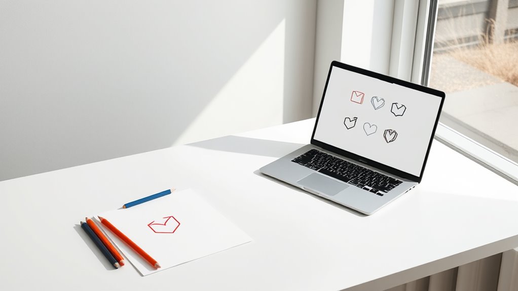
Prioritizing simplicity in logo design guarantees your logo remains clear and memorable across all applications. When your logo is straightforward, it’s easier for viewers to recognize and recall, whether it’s on a tiny business card or a large billboard. Simple logos avoid clutter, focusing on essential elements that communicate your brand’s identity quickly. This clarity ensures your logo stays effective even when scaled down or viewed from a distance. Plus, simple designs are more versatile, adaptable to various backgrounds and media without losing impact. By stripping away unnecessary details, you create a visual that’s timeless and easy to reproduce. Additionally, understanding the principles of designing for scalability helps ensure your logo maintains its integrity across different sizes and formats. Recognizing the importance of brand recognition further reinforces why simplicity is essential for a memorable logo. Incorporating seed-based design elements can also subtly reinforce your brand’s core values and message. Emphasizing visual clarity is crucial as it directly impacts how well your logo communicates its identity in various contexts. Moreover, a simple design reduces the risk of cluttered visuals, making your logo more effective. Ultimately, simplicity is the key to making your logo work seamlessly across every platform and size, strengthening your brand’s consistency and recognition.
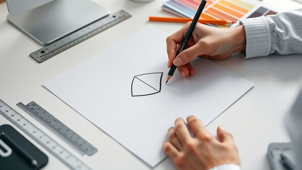
Choosing the Right Shapes and Symbols for Clear Recognition
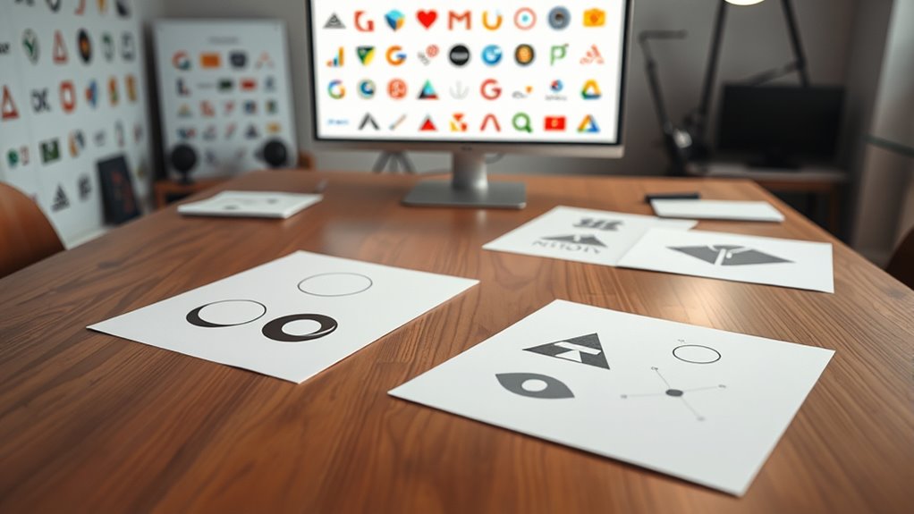
Choosing the right shapes and symbols makes your logo instantly recognizable and memorable. Simple, meaningful designs help people recall your brand quickly, while well-chosen symbols reinforce your identity. When you focus on clear symbolism, your logo communicates your message effectively at a glance. Incorporating distinctive shapes can also enhance your logo’s scalability, ensuring it remains effective across various sizes and formats. Additionally, understanding user control over data collection practices can guide the selection of symbols that resonate emotionally and foster a connection with your audience. Considering the contrast ratio in your design can improve visibility and clarity, especially when scaled down or used in different contexts. Emphasizing diverse genres in design elements can attract a wider audience and add versatility to your branding.
Simplicity Enhances Recall
When designing a logo, selecting simple shapes and symbols is essential because they make your brand easier to recognize and remember. Simple designs reduce visual clutter, allowing viewers to quickly grasp your brand’s identity. Think of iconic logos like Nike’s swoosh or Apple’s apple—they use minimal detail, yet are instantly recognizable. Clear, uncomplicated shapes help your logo stand out across various sizes and mediums, reinforcing recall. Avoid complex patterns or intricate details that can get lost or look messy when scaled down. Focus on bold, clean lines and straightforward symbols that communicate your brand’s message at a glance. Remember, the goal is to create a design that sticks in people’s minds, making your brand memorable long after the first impression. Additionally, understanding the importance of attention in creative practice can help you craft designs that truly capture and hold viewers’ focus. Incorporating geometric principles into your logo design can further enhance its visual harmony and scalability across platforms. Paying attention to visual hierarchy ensures that the most important elements of your logo stand out effectively.
Symbolism Supports Brand Identity
Have you ever wondered how the shapes and symbols in a logo communicate your brand’s core message? When you choose meaningful symbols or shapes, you create an instant connection with your audience. For example, a circle can convey unity and community, while a star might suggest excellence and innovation. Using the right symbols helps reinforce your brand’s values and personality, making it easier for people to recognize and remember you. Incorporating symbolism in design can also enhance the emotional impact and connection with viewers. Additionally, understanding visual communication principles can improve how your logo resonates with your target audience. Consistent symbolism across your logo strengthens your brand identity and builds trust over time. Avoid confusing or irrelevant symbols, as they dilute your message. Instead, select shapes that align with your mission and resonate emotionally. Clear, purposeful symbolism ensures your logo supports a strong, recognizable brand identity across all platforms. Including vacuums for luxury vinyl plank floors as part of your design considerations can subtly communicate quality and care if relevant to your brand.
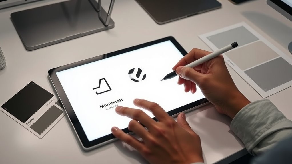
Utilizing Vector Graphics for Flexible Resizing
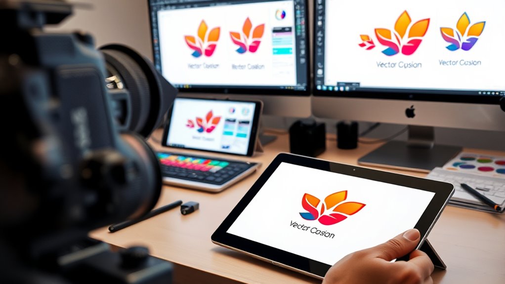
Using vector graphics allows you to resize your logo without guaranteeing your quality or sharpness. This flexibility makes your design adaptable for any medium, from business cards to billboards. When you design with vectors, you make certain your logo remains crisp and professional at any size.
Vector Scalability Advantages
Vector graphics offer a significant advantage in scalability because they can be resized without losing quality. When you enlarge a vector logo, the lines and shapes remain crisp and sharp, no matter the size. This flexibility guarantees your logo looks professional across various platforms, from tiny social media icons to large banners. Unlike raster images, vectors are resolution-independent, meaning they don’t pixelate or become blurry when scaled. This saves you time and effort, as you don’t need multiple versions of the same logo for different sizes. Plus, vector files are easily editable, allowing you to tweak elements without quality loss. Overall, leveraging vector graphics ensures your logo maintains its integrity and visual appeal, regardless of how large or small you need it to be.
Designing With Vector Graphics
Ever wondered how to create a logo that looks perfect at any size? Using vector graphics is the key. Unlike raster images, vectors are made of paths and mathematical formulas, so they can be scaled infinitely without losing quality. When designing with vectors, you work with software like Adobe Illustrator or Inkscape, which allows you to create clean, crisp lines and shapes. This flexibility guarantees your logo remains sharp whether it’s on a tiny business card or a massive billboard. You can easily tweak details, colors, and proportions without worrying about pixelation. Plus, vectors are versatile; they work well for printing, digital displays, and everything in between. Embracing vector graphics ensures your logo maintains its integrity at any size.
Limiting Color Palette for Consistent Visual Identity
Have you ever wondered why successful brands stick to a limited color palette? Using just a few core colors helps create a strong, recognizable identity. When your logo’s color scheme is consistent across all platforms, it becomes easier for your audience to remember and associate your brand with specific qualities. Limiting your colors also simplifies reproduction, ensuring your logo looks good whether it’s on a small business card or a giant billboard. Avoid choosing too many shades or complex gradients, which can dilute your brand’s clarity. Focus on selecting a handful of versatile, impactful colors that reflect your brand’s personality. This consistency builds trust and reinforces your visual identity, making your logo more memorable and scalable across different media.
Ensuring Readability and Legibility at Any Size
How can you guarantee your logo remains clear and legible regardless of its size? First, choose simple, bold fonts that are easy to read even when scaled down. Avoid intricate details or thin lines that can become blurry or lost at smaller sizes. Make sure there’s enough contrast between your logo elements and background to enhance visibility. Test your design at various scales to identify potential issues early. Keep spacing generous enough to prevent elements from crowding or merging. Also, limit the number of fonts and colors to avoid visual clutter. By focusing on clarity and simplicity, you ensure your logo communicates effectively, whether on a tiny business card or a large billboard. Consistently prioritize readability to strengthen your brand’s recognizability across all sizes.
Testing Logo Variations Across Different Mediums
To guarantee your logo works effectively across various mediums, you need to test its appearance in multiple contexts, such as print, digital screens, merchandise, and signage. This process reveals how your design performs in real-world scenarios and highlights potential issues like loss of detail or poor contrast. When testing, view your logo at different sizes and in diverse lighting conditions to ensure consistency. Pay attention to how colors translate across formats, and check for readability when scaled down or up. Consider printing a sample or viewing it on various screens. By thoroughly evaluating your logo’s adaptability, you can identify adjustments needed to maintain visual impact and clarity across all mediums, ensuring your brand remains recognizable and professional everywhere it appears.
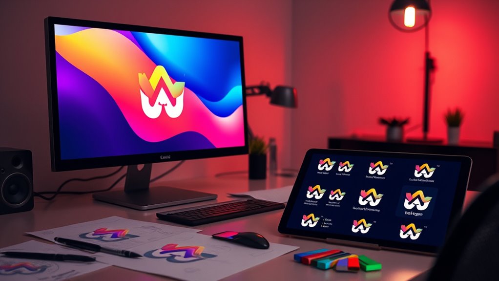
Creating Multiple Logo Formats for Different Uses
Creating multiple logo formats is essential to make certain your brand looks professional and consistent across all platforms. By preparing different logo versions, you ensure versatility and clarity regardless of where your logo appears. Here are four key formats to consider:
- Vector files (AI, SVG) – Perfect for scaling without loss of quality, suitable for print and large displays.
- Raster images (PNG, JPEG) – Ideal for digital use, providing transparent backgrounds and quick loading times.
- Simplified icon or favicon – A small, recognizable version for browser tabs and mobile apps.
- Black and white versions – Ensures your logo remains impactful without color, useful for monochrome printing or embossing.
Having these formats ready guarantees your logo adapts seamlessly across all uses.
Considering Negative Space and Balance in Design
You can create more impactful logos by using negative space cleverly, making your design stand out. Achieving visual balance guarantees your logo looks appealing and professional across various contexts. Simplifying elements helps maintain versatility, so your logo remains recognizable no matter where it’s used.
Leveraging Negative Space Effectively
Negative space, when used intentionally, can transform a logo from simple to memorable by emphasizing balance and visual harmony. To leverage negative space effectively, focus on these key principles:
- Identify Hidden Shapes: Use negative space to reveal subtle images or symbols that reinforce your brand identity.
- Maintain Clarity: Ensure the negative space doesn’t clutter the design; it should enhance, not obscure, the main elements.
- Create Visual Flow: Use negative space to guide the viewer’s eye smoothly through the logo’s components.
- Balance Elements: Distribute positive and negative space evenly to achieve harmony and prevent visual tension.
Mastering these techniques helps your logo become more versatile and impactful across various sizes and mediums.
Achieving Visual Balance
Achieving visual balance in logo design guarantees that all elements work harmoniously, making the overall composition pleasing and memorable. Balance ensures no part overwhelms the design, guiding viewers’ eyes smoothly across the logo. To illustrate, consider how different elements contribute to this harmony:
| Element Type | Placement | Effect |
|---|---|---|
| Text | Centered or aligned | Creates stability |
| Negative Space | Even distribution | Adds clarity and breathing space |
| Icon or Symbol | Balanced with text | Enhances recognition |
Striking the right balance involves adjusting size, spacing, and positioning. When done well, your logo feels unified, professional, and scalable across various sizes.
Simplifying for Versatility
Simplifying a logo enhances its versatility by making it easily recognizable and adaptable across various applications. To achieve this, pay close attention to negative space and balance. First, guarantee negative space is intentional; it should add meaning without cluttering the design. Second, maintain visual balance by distributing elements evenly, avoiding overcrowding on one side. Third, focus on clean lines and minimal details, which improve clarity at small sizes. Fourth, test your logo in different contexts—print, digital, large, small—to confirm it remains effective. Simplification reduces complexity, ensuring your logo retains its impact regardless of scale. By thoughtfully considering negative space and balance, you craft a versatile logo that maintains clarity, strength, and recognizability across all mediums.
Regularly Reviewing and Updating Your Logo for Future Compatibility
To guarantee your logo remains effective and relevant, it’s essential to review and update it regularly. Trends evolve, and your brand’s identity may shift over time. By periodically reassessing your logo, you ensure it continues to represent your business accurately. Consider how your logo appears across different platforms and sizes—what works today might not tomorrow. Staying proactive helps avoid outdated or cluttered designs. Use the following table to guide your review process:
| Aspect to Check | Action to Take |
|---|---|
| Scalability | Test in various sizes |
| Relevance | Align with current branding |
| Trends | Incorporate modern elements |
Regular updates keep your logo fresh, recognizable, and adaptable for future growth.
Frequently Asked Questions
How Does Logo Scalability Impact Brand Recognition?
Logo scalability directly affects how easily your brand is recognized across various platforms. When your logo is clear and adaptable at any size, it ensures consistent branding, whether on a tiny social media icon or a large billboard. If your logo isn’t scalable, it can become blurry or unrecognizable, weakening brand recognition. So, designing a scalable logo helps your audience identify your brand quickly, no matter where they see it.
What Are Common Mistakes to Avoid in Scalable Logo Design?
Did you know 75% of consumers judge a brand’s credibility based on its logo? When designing a scalable logo, avoid common mistakes like overly intricate details that get lost at small sizes or relying solely on color without considering versatility. You should also steer clear of disproportionate elements and neglecting simplicity, which can hinder recognition across various platforms. Keep your design clean, adaptable, and easy to identify at any scale.
How Can You Balance Creativity With Scalability in Logo Design?
Balancing creativity with scalability in logo design means you should prioritize a simple, versatile concept that allows for creative expression without losing clarity at any size. Focus on clean lines, limited colors, and distinctive shapes that can be easily adapted. You can add unique touches or subtle details, but always guarantee they stay recognizable and effective across all formats. This approach keeps your logo both innovative and adaptable for various uses.
What Tools Are Best for Testing Logo Scalability Effectively?
You can test logo scalability effectively by using tools like Adobe Illustrator, which allows you to resize your logo without losing quality. Additionally, tools like Canva and Figma help you preview how your logo appears across different platforms and sizes. You should also consider using mockup generators to see how your logo performs on various backgrounds and materials, ensuring it remains clear and impactful at any scale.
How Should Scalable Logos Adapt to Different Cultural Contexts?
Did you know that over 60% of global consumers prefer brands that respect their cultural differences? When adapting logos for different cultures, you should research local symbols, colors, and language nuances. Stay flexible with your design so it’s recognizable yet culturally sensitive. Test your logo in various contexts to make sure it resonates positively. By doing so, you build trust and brand loyalty across diverse markets effortlessly.
Conclusion
While designing a scalable logo might seem straightforward, it’s ironically the trickiest part of branding. By keeping things simple and versatile, you’ll think you’ve nailed it—until the next big platform update or print challenge. Remember, no matter how perfect your design looks now, it’s only as future-proof as your willingness to revisit and refine it. Embrace the endless cycle, because in logo design, true scalability is a moving target you’ll never fully capture.